

For the global automotive industry, the past decade has ushered sweeping change not only on the technological front but also in the presentation of their brand logos. It’s a design trend adopted by several tech start-ups, right around 2011, with most car brands having followed suit shortly after, ditching elaborately carved logos for flat, two-dimensional ones.
Gone is the metallic sheen of the chiselled cast-iron crest, having been reduced to a simpler, monotone x-ray of its former self. And practically no car brand has displayed any resistance. BMW, Toyota, Nissan, Volkswagen, Audi, Cadillac, Mini, Volvo – the whole lot have eschewed three-dimensionality and prostrated themselves at the altar of minimalism. But does the trend come with a clear strategic advantage, or have the design teams of automotive giants simply succumbed to an undefinable diktat of contemporary design?
Shift of focus
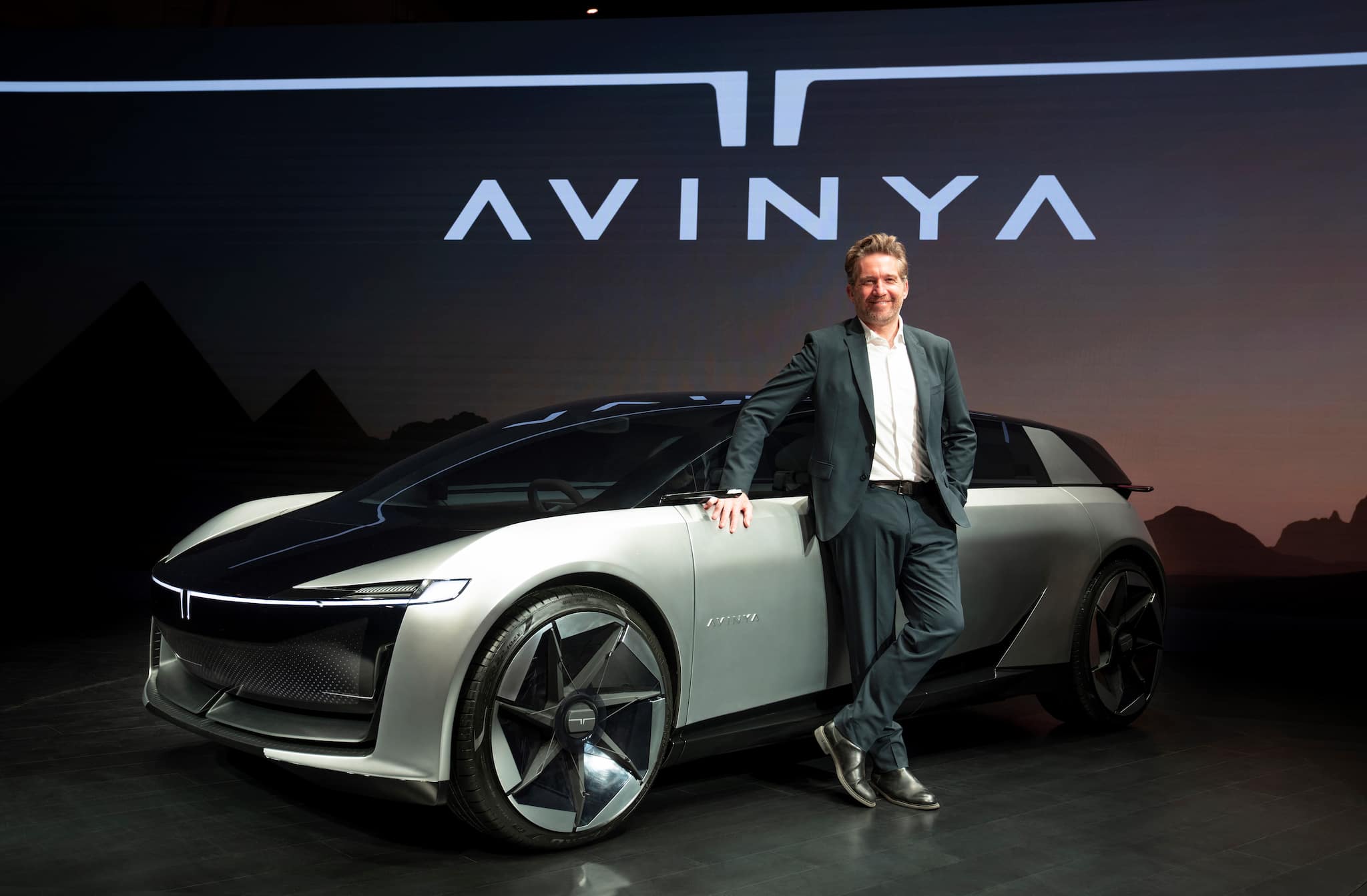
 Tata Avinya
The reasons are manifold, according to Martin Uhlarik, the Head of Global Design at Tata Motors, who attributes the change to both strategic and stylistic reasons. “It’s not just automotive companies, most brands have modernised their logo. And the reason for this is it works much better on a website or an app.’’
Uhlarik also happens to be the chief creative force behind Tata’s Gen 3 and Gen 2 architecture-based EV models, such as the Curvv and Avinya concepts. Both are undisputedly forward-looking models, steeped in contemporary design trends. But unlike several start-ups and new-age brands which may have spearheaded the design movement, most car brands, including Tata Motors, have a storied past built on the promise of solidity, robustness, and mechanical integrity.
Also read: Tata Motors rises nearly 2%, MD shares ambitious EV plans
It’s easy to see why. The automobile has leapfrogged into the highly digitised territory, offering a more digitised experience with connected car tech, ADAS (advanced driver assistance systems), and other such functions being the key differentiators. Pratap Bose, Chief Design Officer, Mahindra & Mahindra, says: “Fit, finish, and reliability are a given. We don’t need to communicate that.”
Behind the logo redesign is also a tectonic shift in how the world now perceives cars and the automotive industry, according to Uhlarik. “We’re going from transportation to mobility. Those are big shifts in how people perceive the product. And the reality is that younger generations are reluctant to purchase a vehicle. We’ve seen that in global trends. They do not see the automotive industry as a forward-thinking industry. So we need to make sure that our products communicate that they are actually part of the solution and part of the future.”
Adapting to new technology
 Martin Uhlarik
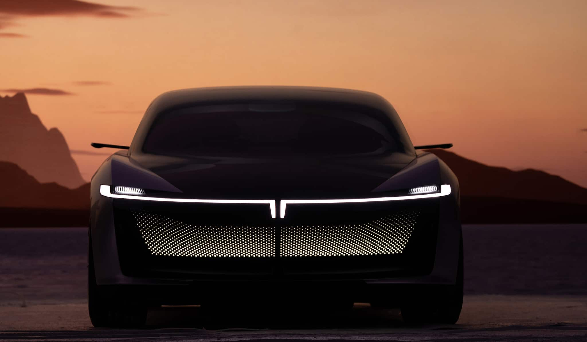
Uhlarik points to a more practical reason why simpler, two-dimensional logos are preferable from a strategic standpoint. It’s got more to do with the actual technology than the shift in how cars are perceived. “We (Tata Motors) are planning to integrate radar and ADAS into the logo. So I can keep the front and rear design very clean. The Avinya concept, for example, integrates the lighting signature with the logo.”
There are also backlit logos, which are now legal in many countries. “Our logos are designed to light-up very well,” says Bose, adding that the edges of the twin peaks logo will be backlit. This makes sense since logo visibility at night was the final frontier that needed conquering in terms of brand visibility, and three-dimensionality ceased to matter in that context. In hindsight, it seems like a move that should have happened a while ago, since every automotive brand would like to be recognised from a mile away, especially in low-lit conditions.
Still, Bose maintains that the Mahindra & Mahindra logo redesign – his first order of business after taking over as CDO in mid-2021 – predominantly follows a three-dimensional design. It’s a take that sets Bose out as a minority, but the logic is indisputable. Automotive logos, unlike those of, say, Instagram and Uber, do not exist plainly in the digital realm. They are all over the car, the wheel hubs, the steering, and even the key fob. A certain degree of tactility is needed when the sense of touch is thrown into the mix. “I see the (Twin Peaks) logo as something carved out of granite,” he adds.
 Mahindra's recently redesigned Twin Peaks logo
Digital playground
“The overwhelming trend is to go flat because a logo is everywhere on social media and beyond,” says Bose, arguably the most famous Indian car designer on the international stage. Most are of the belief that a simpler, flat logo design is simply more memorable than a complex one. In a world where digital users are inundated by things vying for their attention, a simple design stands out. It’s also easier to render.
“If I take an angled surface, where you get different shades and have to figure out where the light is coming from, it comes across as old-fashioned,” says Uhlarik, a strong evangelist of the church of simplicity, and adds that now, more than ever, logos are ubiquitous.
“We have dedicated designers working on the HMI (human-machine interface), UX, UI, so that the logo is duly considered on every platform,” he explains.
Pierre Leclerqc, the Head of Design at Citroën – a brand that’s given the car world some of its most memorable and quirky designs – attests to this. In fact, Leclerqc goes a step further and brings the metaverse into the picture.
 Citroen Mr. Pierre Leclercq
“The metaverse is something that we’re really exploring. We’ve done a big job with the metaverse last year, where we created a 3D world of Citroen with our logo serving as the architecture of a building,” says Leclercq, adding that, “The same goes for artificial intelligence. You have to embrace those technologies. I have a product designer from LA who showed me his design. He was designing drones. The first ideas and proposals were made by AI.”
For Uhlarik however, the Metaverse isn’t an immediate priority, and it certainly doesn’t influence the design of the logo or the upcoming crop of electric cars from Tata Motors. “At the moment, we’re still designing for our dimension, for the lack of a better word. The metaverse is an emerging area, which is still being defined.”
The benefits of simplicity
Leclerqc steadfastly believes in the power of simplicity. In this regard, Citroën was always ahead of the curve, having started out with a very simple, two-dimensional chevron as its logo a little over a century ago. And it’s a version of that logo that Citroen has returned to. “The simpler, the better. The more complicated we make it, the more difficult it is to remember,” says Leclercq, stating that purely from a memorability POV, a simple design has a more lasting impact.
 New Citroën Logo
Uhlarik is of the same opinion. The “T” shaped lighting signature on the Avinya concept — a design that heralds Tata’s born-electric Gen 3 range of electric cars – was, according to Uhlarik, an instant hit, and left no doubt in anyone’s minds as to which brand it represented. In a world of Teslas and Toyotas, the simple two-pronged “T” lighting up the front of the Avinya instantly marks it out as a Tata.
Bose, however, still prefers the effect that a three-dimensional logo brings to the table and prefers a logo that can adapt to any canvas. “Your screen resolution has increased, so most digital displays can display 3D logos a lot better today,” he says, adding that virtual three-dimensionality is also the domain the metaverse operates in.
The downside
Many have rightly accused brands of making their logos “bland,” stripping them of detail and character in an effort to make them more accessible. There’s also an inherent risk that in their pursuit of recognisability and their submission to the allure of simplicity, these logos run the risk of becoming forgettable. “For us, the new logo, which debuted on the XUV700, was introducing us to a new audience, new markets,” says Bose, “but it also had to represent 75 years of our past.”
Leclercq appears to have lucked out, since the design ethos of the original Citroën is in line with that of today, suggesting that some of these trends are cyclical.
“Our new logo shows a clear departure from the round, artistic designs of the past, to the pure technical lines that represent our future,” he adds.
But regardless of how much emphasis designers put on the meaning inherent in their logos, it is not incumbent upon the logos alone to tell the brand’s story, past, present and future. Much like the logos, and the cars themselves, the stories of these brands are in perpetual transit. Change, after all, is the only constant.
The growing importance and democratisation of design
Leclercq also threw light on the growing importance of design as a key differentiator in car purchase decisions. “Earlier, there were only a few car design houses in the automotive industry. Today, so much investment has gone into design studios to ensure that vehicles have a really strong design DNA.”
With cars slowly morphing into personal mobility devices, design will be a key differentiator now more than ever, especially when it comes to EVs which can completely rewrite the rulebook on automotive design.
Leclercq also says that good design is no longer the exclusive domain of high-end luxury cars. “Today, it’s the cheapest way to differentiate one car from another.”
Discover the latest Business News, Sensex, and Nifty updates. Obtain Personal Finance insights, tax queries, and expert opinions on Moneycontrol or download the Moneycontrol App to stay updated!
Find the best of Al News in one place, specially curated for you every weekend.
Stay on top of the latest tech trends and biggest startup news.