Trending Topics:
- Meta AI
- Snapchat Quick Cut
- iPhone 18 Pro
- Realme 16 Pro
- World War Z
Google updated its Chrome logo after 8 years, a look at the logo’s journey over the years
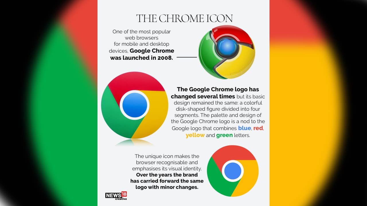
Google is changing its Chrome browser logo for the first time in eight years. The Google Chrome logo has changed several times but its basic design remained the same. Take a look at the redesigned logo with some minor adjustments.
1/4

Google is changing its Chrome browser logo for the first time in eight years. The Google Chrome logo has changed several times but its basic design remained the same. (Image: News18 Creative)
2/4

Google Chrome was launched in 2008 with a shiny, three-dimensional emblem. In March 2011, Google introduced a new simplified logo to replace the previous 3D logo that had been used since the project's inception. (Image: News18 Creative)
3/4

In the new readjusted Chrome logo, the circle in the famous logo has gotten a little bigger and a new shade of subtle gradient was added to the main icon. This was done to supposedly reduce the friction caused by placing certain shades of green and red, next to each other. (Image: News18 Creative)
4/4

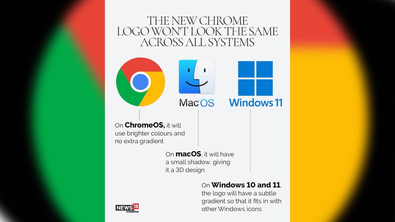
The new Chrome logo won’t look the same across all systems. Take a look… (Image: News18 Creative)
Discover the latest Business News, Budget 2025 News, Sensex, and Nifty updates. Obtain Personal Finance insights, tax queries, and expert opinions on Moneycontrol or download the Moneycontrol App to stay updated!


