")
Charts and graphs are used ubiquitously to understand and display financial performance-related information of various companies and/or financial instruments. However, if the graphs are not carefully constructed, they can inadvertently convey inaccurate information, leading to poor choices by investors or traders. Sometimes graphs are purposely constructed in a way that might mislead the viewer and unfortunately many stock-related graphs fall in this category. Here are five googlies to watch out for if you regularly use data visuals to understand financial information.
1) Truncated Bar Graph: Bar graphs are staple constructs when different values need to be compared. Companies regularly use bar graphs to report profits or revenues for the last few years. However, the golden rule in creating bar graphs is to make sure that the scale of the quantitative axis starts at zero. A truncated axis has the effect of exaggerating differences between values and is highly misleading. In the example below (left), a company reporting its annual profits for last year and the current year uses a truncated y-axis scale. The viewer may mistakenly conclude that profits for this company have almost tripled (as one bar is almost three times the other) whereas actually the increase in profits is less than 10 percent. The graph on the right is the accurate way to render such information, which clearly shows how close the two values are.
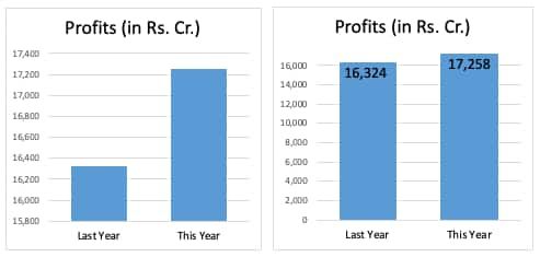 Truncated Bar Graphs
2) Circles for Values: It is common practice to report market capital for different companies using circles of different sizes. Many financial reports use this technique to allow viewers to quickly compare market capital for a range of companies. Here, too, there is scope for misinterpretation of data. Often, analysts encode the value to be visualized in the diameter of the circle instead of the area. This lands up vastly exaggerating the differences in the sizes of the circles. In the example below, Company 1 has a market capital which is roughly half that of company 2’s, but looks closer to one-fourth its value. The graph on the right has the two circles in the correct proportion to each other.
 Circles for values
3) Dual Axis graphs for correlation: A dual axis graph is often used to compare two trends of two different variables which are typically very different in magnitude or could even be in two completely different units. Stock market advisers often use this technique to try to convince investors of the correlation between two variables – say the GDP of a country and a particular financial instrument. However, dual axis graphs are problematic because the scales can arbitrarily be chosen so that it looks like there is a correlation between the two variables. These graphs are highly susceptible to manipulation and most data-visualization experts warn against using them. In the example below, the first dual axis graph has scales carefully chosen to look like the two trends are highly correlated. However, the other three dual axis graphs also depict the same dataset and see for yourself how different they look from the first one and from each other. If you are presented with a dual axis graph to justify a correlation between two variables, ask for a scatterplot or a connected scatterplot instead. These are more robust constructs for analysing the relationship between two independent variables.
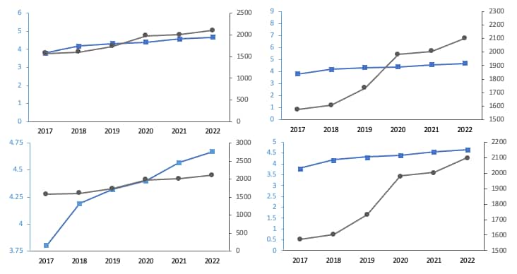 Dual Axis graphs for correlation
4) Deflated currency: Most graphs that depict how the value of a stock or commodity has changed over time use trend lines. These lines typically slope upwards over the years and promise a significant increase in the value of your holdings over time. Companies that report their revenues or profits over time also use trendlines with similar feel-good upward moving lines. However, almost all of these graphs do not account for inflation (purchasing power) in their depictions. Which means what the investor is looking at is the nominal return on their investment whereas the real return of the investment is far less. It is up to you to adjust what you see in the graph so that the upward sloping lines do not deceive you and the deflated currency does not inflate your understanding of the purchasing power of your portfolio.
5) The ubiquitous stock chart: Most online portals that provide financial information about companies display stock charts. These charts show how an individual stock value for a company has fluctuated over time. While these charts are useful for current owners of the stock to evaluate the value of their holdings, they can be quite misleading for prospective investors. Investors looking at a company’s financial performance should analyse its market capitalization (market cap) rather than the price of an individual stock, which can fluctuate due to a variety of reasons, including changes in the number of outstanding shares. The market cap, which is calculated as the product of the current individual share price and the total number of outstanding shares, is considered a robust metric for assessing the strength of a company. An ideal chart for potential investors would thus be the trend of market cap of a company instead of the share price.
Discover the latest Business News, Sensex, and Nifty updates. Obtain Personal Finance insights, tax queries, and expert opinions on Moneycontrol or download the Moneycontrol App to stay updated!
Find the best of Al News in one place, specially curated for you every weekend.
Stay on top of the latest tech trends and biggest startup news.