

Humans these days are getting pretty good with understanding data. But visual analysis can be a great add-on, delivering insights which would otherwise take minutes for someone to figure out from the numbers.
A specially interesting way to make data visual is the Sankey Chart. This was named after Captain Sankey, a 19th century railway engineer who designed the Sankey to show the movement of steam through a railway engine. So even the modern version of a Sankey Chart or diagram looks like water streams flowing in and out. And it is an especially easy way to display the movement of money.
Foreign Institutional Investors and Domestic Institutional Investors have deep pockets, and the amount of money they put in or pull out of the stock market strongly affects index movement. To make the flow of FII and DII money easy to understand, we turned to the Sankey Chart, and the resulting FII/DII Analysis provides a clear picture of daily inflows and outflows of cash from these investors. Green streams are net positive - inflows, while red streams are net negative - outflows.
FII DII Analysis
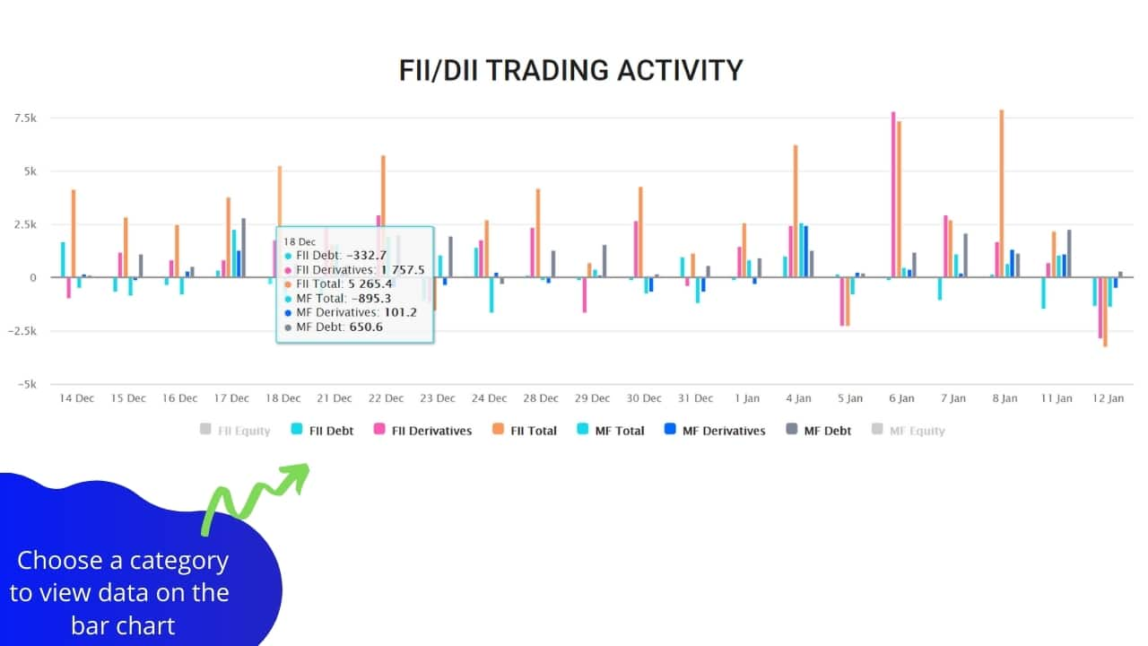
The top bar chart on the FII/DII page shows you an overall view of how much these large investors are buying and selling. It gives you snapshots, daily data, as well as weekly and monthly information for cash, debt and derivative inflows and outflows, for both FII investors and MF investors.
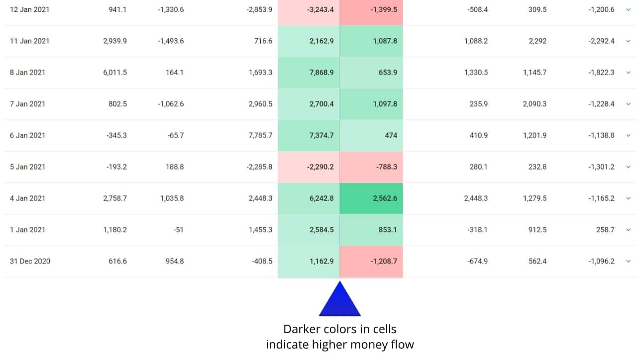
Scroll down, and the snapshot table on the same page gives you a detailed visual analysis of FII and DII flows day to day over the past 30 days, as well as daily data when you scroll down. Each row on the table can be expanded into a Sankey diagram showing you the inflows and outflows.
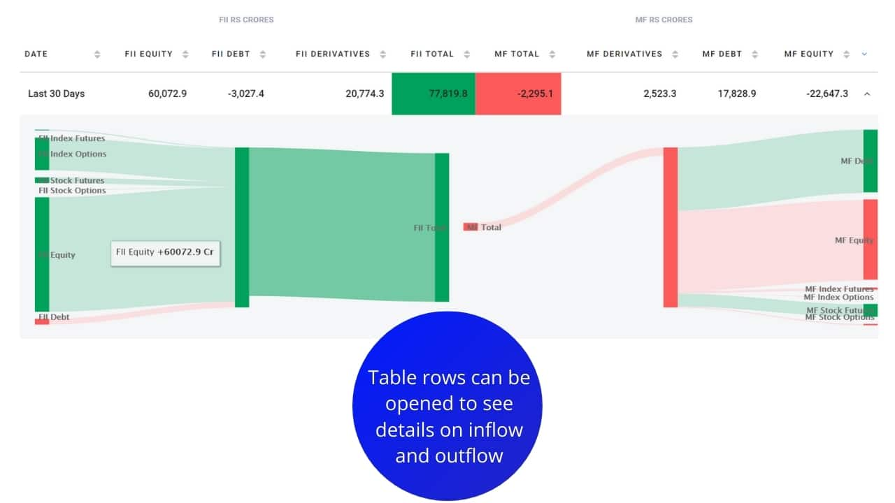
The closed table also behaves like a heat map, where the columns are color coded to indicate the intensity of inflows and outflows from FIIs and DIIs. Darker greens indicate bigger inflows than average. Darker reds indicate bigger outflows than average:
Building visualizations makes what would have been a complicated analysis of institutional buyers and sellers, easy to understand at a glance. People love pictures and color - we find that a lot easier to read than rows and rows of numbers. With Sankey flows and heat maps, data becomes visually appealing and a lot more accessible.
This is a sponsored post.
Discover the latest Business News, Sensex, and Nifty updates. Obtain Personal Finance insights, tax queries, and expert opinions on Moneycontrol or download the Moneycontrol App to stay updated!


